03.10.2018
Forex charts (example: Japanese candles, bar chart) serve as ground of technical analysis, and besides allow monitoring behavior of trading contracts by eye. We will now discover the following notions, which are often used for reviewing price charts:
• open price – the price of the first transaction within the reviewed time interval;
• close price – the last price for the present time interval;
• High – the largest price for a certain time interval;
• Low – the least price within time interval;
The most popular time-frames are: W1 (week), D1 (day), H4 (4 hours), H1 (1 hour), M30 (half of hour), M15 (15 minutes), M5 (5 minutes).
The simplest type of Forex chart is the linear – jogged line, which more often is built for close prices.
Bar chart is more popular than linear because contains rather more information. Bar represents block diagram picturing row of price changes for a time period. It also shows above mentioned parameters: open price (left line), close price (right line), maximum (bar’s top point) and minimum (bottom bar’s point). If close price exceeds open price, that is to say right line is above left, then we see the bar showing growth of price for a certain time period.
Chart of Japanese candles represents the same information on price change that bar chart does. The only difference is that Japanese candles have “body”. If close price is above open price, then candle “body” is covered with white, if it is vice-verse, then color is black. It is necessary to note that modern trading terminals allow to paint candle “body” with any color, therefore they are not always black and white. For example, by default chart of Japanese candles in FreshForex terminal looks as below:
Apart from “body”, Japanese candles also have “shadows”: cutting from upper edge of candle body to maximum value – “upper shadow”, cutting from bottom edge to minimum value – “bottom shadow”.
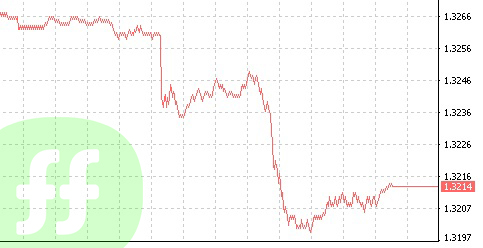
Besides, Forex technical analysis involves tick-by-tick chart, which represents rendering of price by ticks.
Tick is a one-time change of price in any side for a certain number of points (if for one time the price changed for 1 point, it is 1 tick, if for 5 at once, still it will be 1 tick) The most popular view of tick chart which is not tied to time scale is so called dis-proportioned chart:

Tick charts are not appropriate for building long-term forecast, but allow to feel “beat” of the market.